Stylistic Aspirations: Tim Sale
I'm currently reading the Tim Sale Art Compendium/Working life biography "Black + White" that perhaps with some finugeling I can persuade Harvard to some kind of prisoner swap program, although in my view I am palestine giving up one military trained commando for 30 or so scraggly Palestine kidnappees.
In no way however would I suggest that Tim Sale is superior to yesterday's Inoue Takehiko, infact hands down Takehiko is probably the more versatile, prolific and thoughtful of the two.
But Tim Sale probably has to be the bestest most nutritious comic book artist in the west. And reading his take, I draw a lot of paralal's in my limited experience to the key lessons he has picked up in a lifetime of the industry.
First of all, I like the way he thinks. For a while I walked around saying (to those who knew or cared) "Frank Miller's the master of cliche, Jeph Loeb is the real deal" and Sale's most celebrated work are his parings as storyteller with Loeb. You may recognize that 'The Long Halloween' was one of the major basis for 'The Dark Knight'.
But you see you can do a control test and look at Sale's work without Loeb, and Loeb's work without Sale. 'Hush' is inferior it feels like a bit of a romp through a funpark, 'Batman Superman' is borderline terrible, like Men are from mars, women are from Venus, you just need to read the title to know it is going to be an exercise in contrast.
BM: Superman's so light, I hate it.
SM: Batman's so dark, I feel sorry for him.
Ad nauseum. But Sale's work on Grendel, Amazon, Deathblow etc. remains as good, at the very least in terms of visual storytelling.
Of particular inspiration to me is that his characters are actually different. More so than Takehiko's you see a sale picture you know exactly who drew it. Where most artists are striving to imitate manga characters, big eyed females and androgenous boys, really tight lines and attention to detail etc. Tim Sale uses free flowing lines to create people that you could break into pieces and still recognize.
The hands he draws are meaty, the men barrell chested, the girls like retro pin-ups and WWII noseplane art. They are curvy, sensuous and womanly, not girlish.
His take on Batman is for me as I like it, he views Batman & Bruce as these 8 year old kids that have never grown up, never let go of the past. He also draws Batman as physically menacing.
Perhaps some of the best indicators though are in his critiques of other comic book notables:
'Todd is very fussy with a lot of his lines -- Todd has too much shit going on for my taste. I never had any problem with how big the panels were, except the stories weren't interesting... I never had any interest in Spawn or any of the Image books. For me there's got be a story there, and if the story you're telling is not very good, your technique makes no difference.' - On Todd MacFarlane.
'By the time Miller was writing for Mazzuchelli on Born Again, he had it down. And it was still early enough in his career that he wasn't hermetically sealed yet. He really knew how to manipulate a page, how to manipulate twenty pages. But he didn't really know how to end the series -- the supersoldier storyline was just horrific, I think; Miller's last fifteen minutes of fame.' - On Frank Miller.
'If you pick up V for Vendetta and flip through it, you might just put it right down. I did that with Gibbons on Watchmen. I picked it up and thought, too many words, too many panels, there's nothing here that grabs my attention, and I just put it down. Eventually people said to me, "What are you an idiot? Just READ it!" and I did, and I realized it was a book that rewarded close attention.' - On Alan Moore, Lloyd and Gibbons (sort of).
I find these criticisms revealing. For example if I had to pick one reason I'd take Takehiko Inoue over Alan Moore, it would be the word count. There hasn't been a single Alan Moore comic I ever read that was 'un-put downable' I had to get 2/3 of the way through Watchmen before I even found it interesting.
Likewise Frank Miller is a good artist in terms of composition even if I'm not a big fan of his linework, and I'm most familiar with his Sin City stuff, which I feel excels really in the use of negative space. That's something Sale takes away from Miller but he is right to call Miller's storytelling abilities into question, I find Sin City to just be almost a study of 80's LA and have no other real idea behind it, as Alan Moore would say 'a presumption that conflict is inherently interesting' and that 300 is arguably one of the worst stories ever told. It actually was so poor I read 'Persian Fire' to get the Persian Angle on the whole thing, and that was an academic history book.
Just so with Todd MacFarlane, I don't know about the line work, but he like Frank Miller suffers from an inability to really think about the idea behind a story. They end up being pure plot, no message. There's a few flashes of brilliance in the whole Spawn arc, but it is ultimately a forgetable story, convoluted and craptacular.
But what Sale likes I like, for example his nightmare are all the 'detail' scenes, heaps of machinary, gadgets, leaves blowing, busy streetscapes etc. I can't stand these. In drawing FOWP there are about 4 pages in succession where it's in a hall that is supposed to be full of people and panic ensues... those 4 pages took so much out of me, I did 2 per day, and still had to come back and back again, and back again in the inking phase before I was happy with them. Even then one of them is my 'least happy' page in the entire story.
For me though, Sale is all about two things -
1. The use of light and dark.
2. Anatomy.
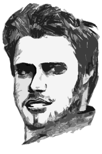
The use of light and dark, you really need to see a 2-tone picture of his to appreciate how much he has his pencils and ink down.
link via timsale1.com
He could almost be working in wood-block or lino-print. He can convey such a sense of depth from a binary composition style. He talks about using charcoal and a shammy cloth and an eraser to do his white lines, instead of working in white on black paper. It's a pretty impressive way to get good at the 'cut-out' feel.
He will also use large flat black spaces to give his backgrounds real menace. He talks about Toth as an influence on his style by saying 'Toth would just make it all silhouttes and call it a day' which is precicely what I did any time I had over 5 people in a frame I needed to draw.
I always shift around my perspective to make a scene look as packed as possible whilst minimising the amount of drawing I had to do. My favorite was to do one panel that portrays a bunch of characters huddled round, then break up the rest of the panels into close ups on the mouth, so you knew who was talking without having to show any of the interpersonal interaction.
Anything to save effort.
Let's move onto the 2.
Anatomy, Tim Sale's Catwoman is my favorite depiction of the character bar-none. It's also the most interesting the character has been. His batman I've already stated is a huge meataxe of a guy, but probably most telling is his Superman. As he descirbes it 'fat doofus?' or 'the thumb with hair?'
My strong point I feel is faces, and sadly only when they are front on. I really struggle rotating the head of a character around. Fortunately I made it easy for myself in the most part with fowp, the one character for whom it would be difficult was the only character I did practice for.
But anyway, Tim Sale does the real, face floating on a circle surrounded by a drawing of a head. There isn't the line work that connects them all, that really only comes in with shading and inking. His anatomy is all outlines, which rather than making it easy, I find makes it harder.
Consider, if you took a 3d illustrating program and constructed a praying mantice model, all you would have to do to turn it around is click and drag your mouse, the proportions will be preserved and the outline silhouette will translate perfectly.
If you draw your anatomy from outlines, leaving yourself with a 2d shape, rotating it becomes immensely difficult because you need to keep in your head a picture of the ever changing outline. It is easier when you do a realistic anatomy, and like Inoue put down all the anatomy, then clothes, then facial expressions. These pencil skeleton + muscle geometric sketches are the only way I find to survive.
But this means I can't use exageration much for my anatomy. I found the character of Udonis in fowp, who is meant to be a towering beefcake really hard. His height changed relative to all the other characters in every successive panel. In the end as an amatuer I had to be happy with him conveying that in principle Udonis is 'tall' and 'big' and leave it at that.
Yet Sale uses these creative anatomies so well and so consistently with characters like Batman, Superman and Hulk. Their physics have no basis in reality, the are herculean monsters. But nobody does it better. Nor conveys such emotions.
And then of course, there are the women. He does literally use anatomy like the old school pin ups. The legs are too long in proportion to their bodies, the women are impossibly curvy, their lips are like something out of a 20's film. They pull off glamour and simplicity and all of it. You wouldn't describe them as fanboy like Miller's nor I think like most other artists currently - self conscious.
Catwoman being a perfect example, she's nobody's pet but Sale doesn't have to go to extreme lengths to make her a self conscious 'Independant Woman' like Charlie's Angels or some shit. The simultaneous femme fatal and feminist comes through. A reconciled sexuality & social consciousness.
Not to suggest that Sale isn't some kind of pervert. I just efforts to make Mary Jane more than the trophy bride she is really forced. You can leave it at 'she earns more money than Peter, but her work is no where near as meaningful and rewarding' and do a great thoughtful piece without having to force superflous brains, insight and intellect in a character that chose to model as a profession.
As I said the way forward for me is in working more with lighting and shading. Tim Sale uses the curved line, which is probably the biggest sticking point in imitating his style. Back in highschool I prefferred making these really angry, unstable pictures by drawing curves out of heaps of straight lines piled on top of one another. I definitely see ways I can take from both Sale's Negative Space techniques and silhouettes and incorporate them immediately into my work.
Having gone through a complete drawing and inking process I now feel I can sit back on the pencils and say - that just needs shading, I can fill it in photoshop or do it with the inks.
I also want to adopt more of his style into Anatomy. Having written my own script I wouldn't part with more then three panels to a page, because I think you lose the ability to really pace something out, put in pauses or high contrast. Some of the extremely busy pages Alan Moore uses are some of my favorites with him. But yes 3 panels to a page is the ideal. And I hate certain kinds of detail. Doing heaps of textures is fun, drawing heaps of facial expressions small scale isn't.
I also think most valuably is his rule of 'making something fun to draw' The monster in fowp was always fun to draw. The alien was interesting. Drawing guard after guard after guard was dull. I wanted to incrementally change each one of them, but it was really taxing and most of them shared the exact same hair style. I vow to learn ways to avoid that next time I write anything. All cast, no extras.
The anatomy though is the most curious, I think I will have to start by drawing things that aren't human, like giraffes, lions, hippos, elephants, kangaroos etc. Then work on humanoids and all sorts of experiments, trying to express abstract concepts like 'fast' in a persons physique. (If you want to see someone who does that really well, I suggest you look at Mr. Evolutions cheetah, they are built for one purpose, running things fucking down).
Perhaps more than any other, Tim Sale is the guy who can make an image out of negative space, and that's something I'd like to have up my sleeve.


No comments:
Post a Comment